OG Image Design Principles: Typography, Layout & Colors
Master the design principles for creating effective OG images including typography, layout composition, and color strategy.
Great OG images follow consistent design principles that ensure readability, impact, and brand consistency.
Typography
Text is the primary element of most OG images. Get the sizing right:
- Title text: 60-100px at 1200px width, font-weight 700-800
- Line spacing: 1.2-1.3 for titles (tighter than web standards)
- Maximum line length: 60-80 characters per line, 2-3 lines maximum
- Subtitle text: 40-50px, font-weight 400-500
- Subtitle length: 100-150 characters total
Font Selection
Font selection matters. Use sans-serif fonts like Inter, Roboto, or Helvetica for maximum readability. Decorative fonts may look appealing at full size but become illegible when scaled to mobile dimensions. Remember: your image will often be viewed at 200-400px width on phones.
Testing tip: Test readability at 50% scale. If your text isn’t crisp and readable when the image is scaled to 600×315px, increase font size or reduce text amount.
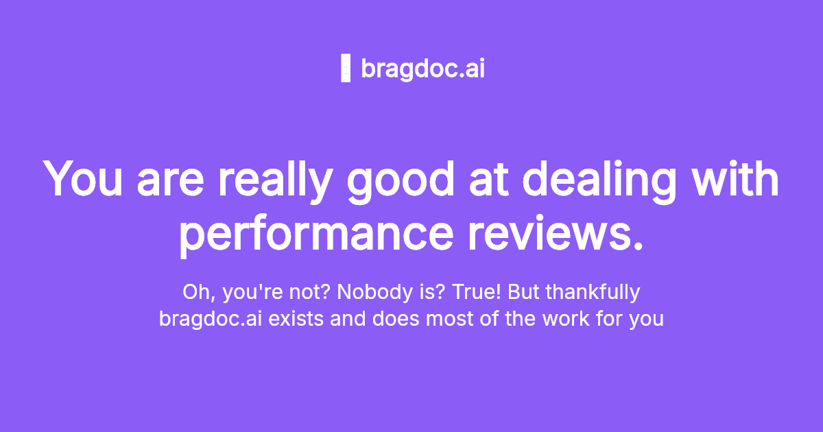
This example demonstrates proper typography hierarchy with domain text, a large title, and descriptive subtitle:

Centered long text
Clean centered SaaS landing page with domain and tagline
Try this example →
Layout Composition
Padding & Safe Areas
Maintain 8-12% padding on all sides (96-144px for 1200px width images). This creates a safe zone where content won’t be cropped by platform variations. Never place critical text or logos in the outer 5% of the image.
Rule of Thirds
Divide your canvas into a 3×3 grid. Place focal points (headlines, logos, key visuals) at the intersections of these grid lines. This creates natural visual balance and guides the viewer’s eye through the composition.
Visual Balance
Avoid perfect symmetry—it can feel static. Asymmetrical layouts with intentional weight distribution feel more dynamic and professional. Use whitespace deliberately; empty space is a design element, not wasted space.
Common Text Placements
- Top-center: Centered headline at 25-35% from top
- Left-aligned: Balanced at 30-40% with visual element on right
- Center: Minimalist approach, maximum impact
- Bottom-anchored: Hero image on top, text band at bottom
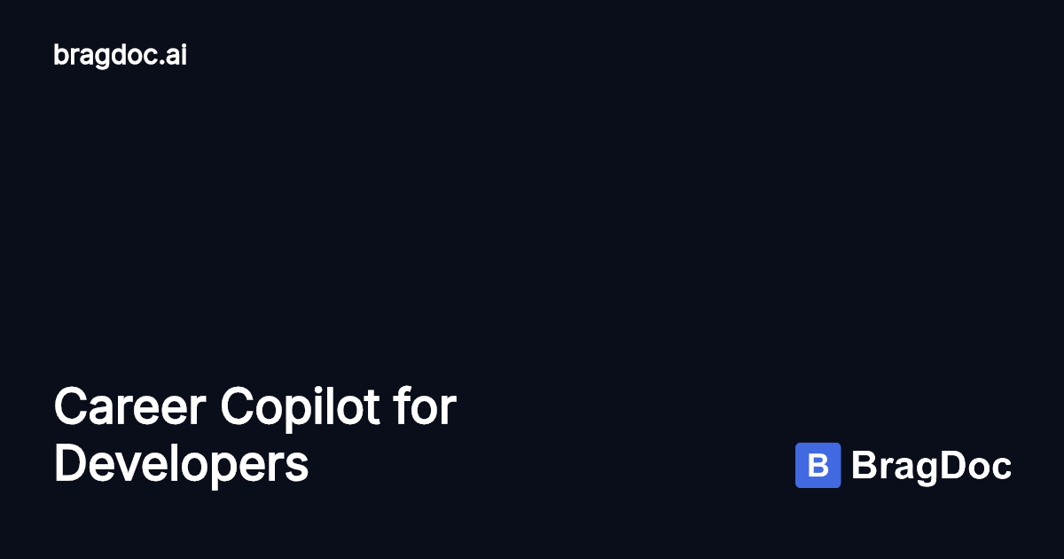
This example shows an effective bottom-anchored text placement with brand identity at top:

Bottom Title
Authentication platform branding
Try this example →
Color Strategy
Dark Backgrounds Dominate
80-90% of successful OG images use dark backgrounds. Why?
- Better contrast with white/light text
- More professional appearance
- Better brand color flexibility
Use dark grays (#1a1a1a to #333333) rather than pure black (#000000) for a more sophisticated look.
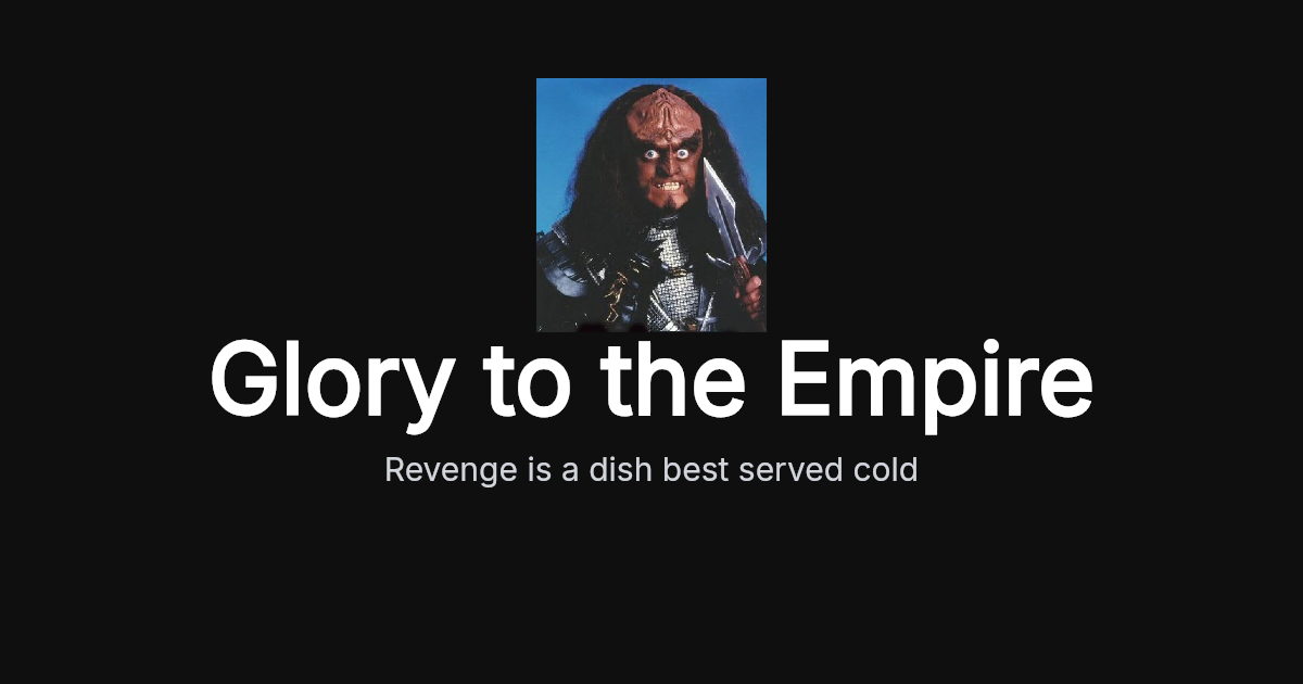
Here’s an example using a very dark background with high-contrast white text:

Simple Centered
Clean centered brand identity with logo and tagline
Try this example →
Contrast Requirements
Aim for a minimum contrast ratio of 4.5:1 (WCAG AA standard), but 7:1 or higher (AAA) is preferable for social media images that may be viewed in bright sunlight or on low-quality displays.
Real contrast examples:
- Dark gray (#2a2a2a) + white (#ffffff): 15:1 - Excellent
- Dark gray (#2a2a2a) + light gray (#cccccc): 5.5:1 - Good
- Dark gray (#2a2a2a) + medium gray (#888888): 2.5:1 - Too low
Light Backgrounds Can Work
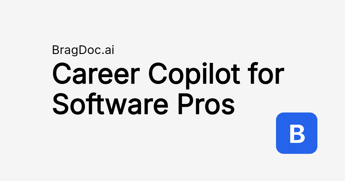
While dark backgrounds dominate, light backgrounds can be effective when you maintain strong contrast with dark text. This approach works well for minimalist, clean brand identities:

BragDoc.ai
Clean minimal layout with domain and large bold title
Try this example →
Working Color Combinations
- Navy/charcoal background + white text
- Gradient background (dark to darker) + white text
- Dominant brand color (darkened 20-30%) + white text with subtle shadow
What to Avoid
- Light backgrounds (reduce text options, feel less polished)
- Red text on dark backgrounds (poor contrast despite brightness)
- More than 3 colors total (creates visual clutter)
Gradients
Linear gradients work well when subtle. Use top-to-bottom or 45° diagonals. Keep colors harmonious (adjacent on color wheel). The text should remain the focal point—gradients support, they don’t dominate.
Content Guidelines
What to Include
- Primary message (always): The “why click?” headline
- Supporting context (usually): Subtitle or clarifying text
- Brand element/logo (recommended): Aids recognition
- Date/context indicators (optional): For time-sensitive content
What to Avoid
- Too much text (more than 3 lines of body text)
- Competing focal points (multiple large elements)
- Distracting background patterns
- Inconsistent styling (mixed fonts, random colors)
Consistency Strategy
Establish a visual system and stick to it. Use the same fonts, similar color palettes, and consistent logo placement across all your OG images. This builds brand recognition. Users should be able to identify your content in a feed based on visual style alone, even before reading the headline.
Ready to apply these principles? Try FrameIt to create professionally designed OG images with built-in best practices.