OG Image Design Patterns: Proven Templates That Work
Explore proven OG image design patterns with examples from GitHub, Stripe, Linear, and other leading companies.
Here are proven design patterns you can adapt for your content, along with real-world examples from leading companies.
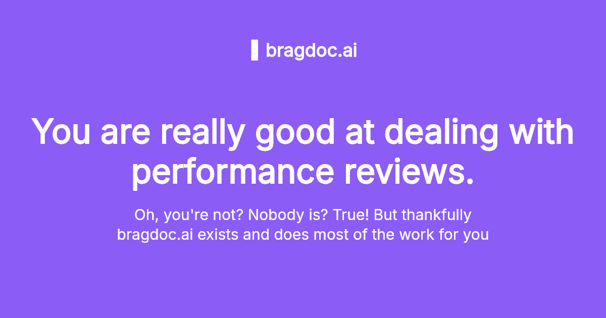
Pattern 1: Centered Title Focus
Large centered title with minimal additional elements. The title is the entire message.
When to use: Thought leadership articles, announcements, content with strong headlines under 50 characters.
Specifications:
- Center text at 35-65% from top
- 80-120px font size
- Dark or gradient background
- Optional small logo in bottom-right corner
Example: Stripe uses this for product announcements—bold headline, sophisticated gradient, minimal distraction.

Centered long text
Clean centered SaaS landing page with domain and tagline
Try this example →
Pros: Clear, impactful, works beautifully on mobile, fast to scan. Cons: Limited context, requires confident headline.
Pattern 2: Left-Aligned Content
Title and subtitle left-aligned at 30-40% from edge, right side for imagery or gradient accent.
When to use: Blog posts, technical content, default safe choice for most content types.
Specifications:
- Left text box occupies 50-60% width
- 70-90px title, 45-55px subtitle
- Background image or gradient on right
- Logo bottom-right
Example: GitHub documentation and Linear blog posts use this pattern—professional, balanced, accommodates both text and visuals.

Feature Card
Feature highlight with icon
Try this example →
Pros: Balanced composition, works cross-platform, professional appearance. Cons: Can feel generic if not executed well.
Pattern 3: Hero Image + Text Overlay
Full-bleed background image with semi-transparent dark overlay and white text.
When to use: Photography-heavy brands, visual-first content, case studies with compelling imagery.
Specifications:
- High-quality background image
rgba(0,0,0,0.4-0.6)overlay- White text with subtle shadow for readability
- 70-100px title
Example: Unsplash uses their stunning photography with minimal text overlay—the image is the draw.
Pros: Striking and unique, high visual engagement, memorable. Cons: Requires excellent photography, more complex to generate programmatically.
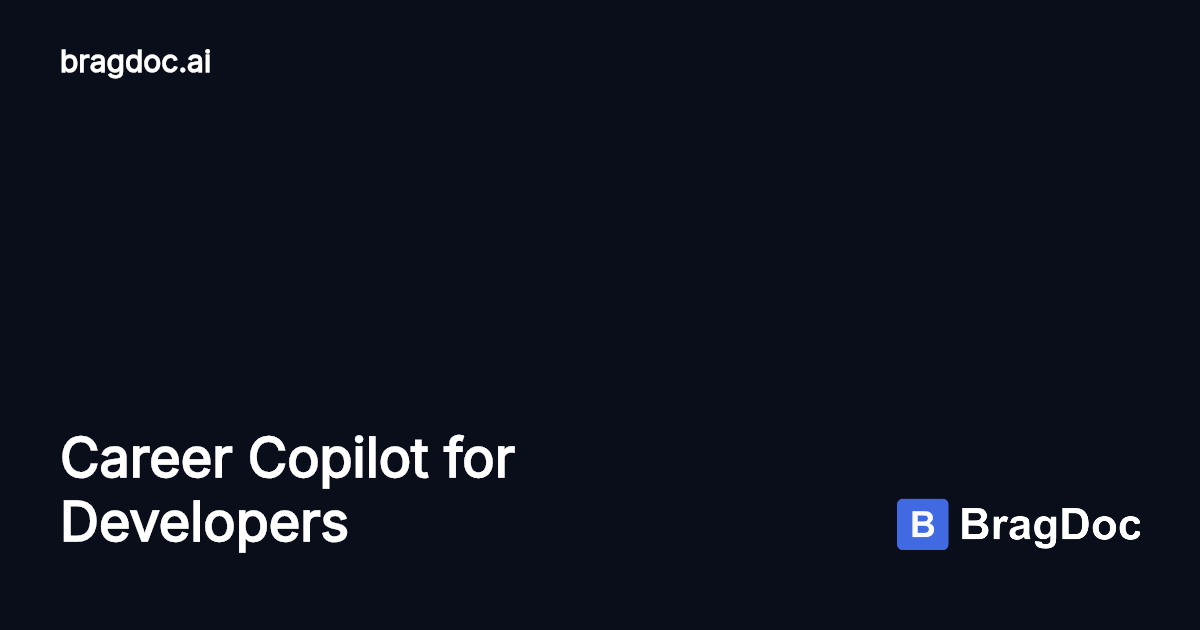
Pattern 4: Bottom Text Anchor
Hero image occupies top 60-70%, solid dark band at bottom with left-aligned text.
When to use: Tutorials with screenshots, product feature announcements, case studies.
Specifications:
- Image fills top 60-70%
- Dark background (charcoal/navy) bottom 30-40%
- White text with 10% left padding
- 70px title, 40px subtitle
Example: Tutorial blogs and SaaS product updates use this to show the product while maintaining clear messaging.

Bottom Title
Authentication platform branding
Try this example →
Pros: Clear hierarchy, modern aesthetic, works for complex content. Cons: Requires good top image, text area can feel cramped.
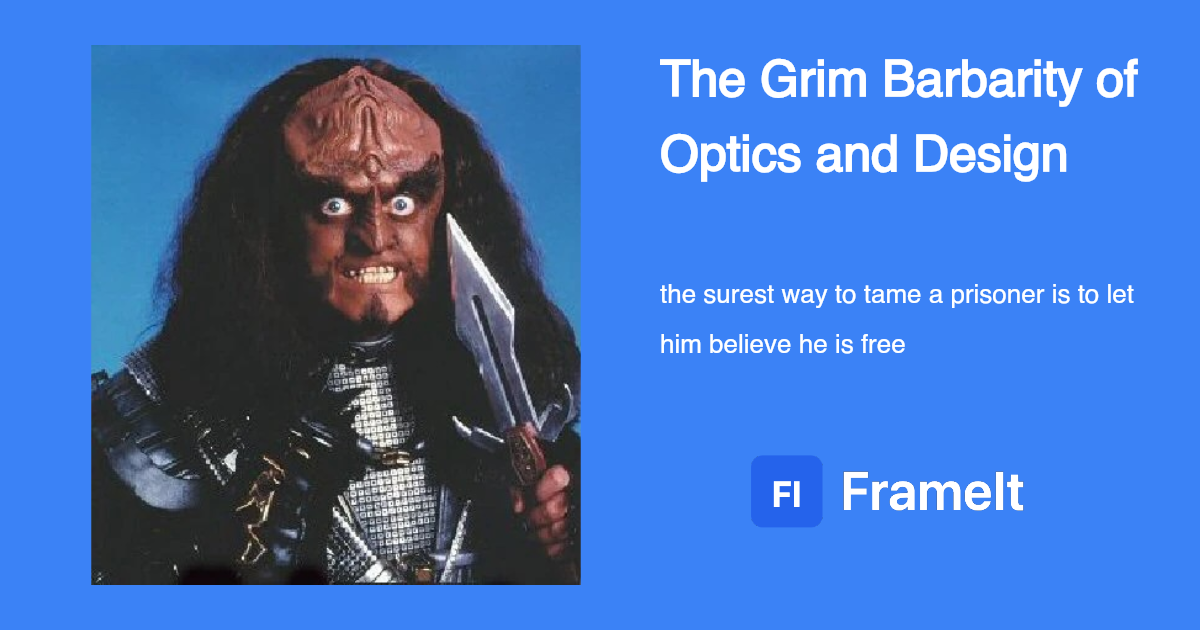
Pattern 5: Dual Column
Split-screen with left content and right visual/message, each with distinct treatment.
When to use: Comparisons, before/after content, complementary concepts.
Specifications:
- 50/50 split
- Left side dark with white text
- Right side with accent color or image
- Perfect vertical center alignment
Example: Webflow showcases use this for product comparisons—left shows product, right shows benefit.

Featured Image Left
Split layout with screenshot and branding
Try this example →
Pros: Professional, structured, shows contrast effectively. Cons: Requires content for both halves, can feel static.
Examples from Leading Companies
GitHub
Pattern: Left-aligned content with code/technical visuals on right
Why it works: Speaks to developer audience, code snippets provide context without distraction
Key technique: Using actual code or product screenshots as visual support builds credibility
Stripe
Pattern: Centered title with sophisticated gradients
Why it works: Premium brand perception, memorable color combinations, trusting the headline to carry the message
Key technique: Different gradient styles for different products/content types while maintaining brand consistency
Linear
Pattern: Bottom text anchor with product UI screenshots
Why it works: Shows the product directly, minimal text matches brand voice, appeals to design-conscious audience
Key technique: Product screenshots build confidence and give users a preview of the interface
Webflow
Pattern: Dual column with product showcase + description
Why it works: Shows capability (product) and benefit (text) simultaneously in professional layout
Key technique: High-quality product imagery balanced with clear value proposition
Notion
Pattern: Centered title with minimal icon elements
Why it works: Matches clean brand aesthetic, readable at all sizes, strategic whitespace
Key technique: Small icon elements add visual interest without cluttering the message
Applying These Patterns with FrameIt
FrameIt’s layout system enables rapid creation of professional OG images using templates. The platform demonstrates flexibility by showing how the same content can be rendered with different layout styles—from minimal centered designs to complex dual-column compositions—all while maintaining visual consistency.
Ready to try these patterns? Use FrameIt to generate professional OG images in minutes.