OG Image Common Mistakes: 8 Errors That Hurt Engagement
Avoid these common OG image mistakes including poor contrast, wrong dimensions, inconsistent styling, and more.
Even well-intentioned OG images can fail to perform. Here are the most common mistakes and how to avoid them.
1. Too Much Text
What goes wrong: Text becomes illegible when scaled to mobile size. Users can’t quickly understand the message.
Why it happens: Writers want to include full headline + description + call-to-action, cramming too much into limited space.
How to avoid: Limit to 2-3 lines maximum. Often, title alone is better than title + subtitle. Test at 50% scale. Edit ruthlessly—every word must earn its place.
Here’s an example of a clean, focused design with minimal text that remains readable at any size:

Simple Centered
Clean centered brand identity with logo and tagline
Try this example →
2. Ignoring Contrast
What goes wrong: Text is hard to read, image looks unprofessional, fails accessibility standards, reduces engagement.
Why it happens: Choosing color combinations based on aesthetics alone without systematic testing.
How to avoid: Always check contrast ratios with WebAIM Contrast Checker. Aim for 7:1 (AAA) or minimum 4.5:1 (AA). Test with color blindness simulator. When in doubt, use high-contrast combinations like dark gray + white.
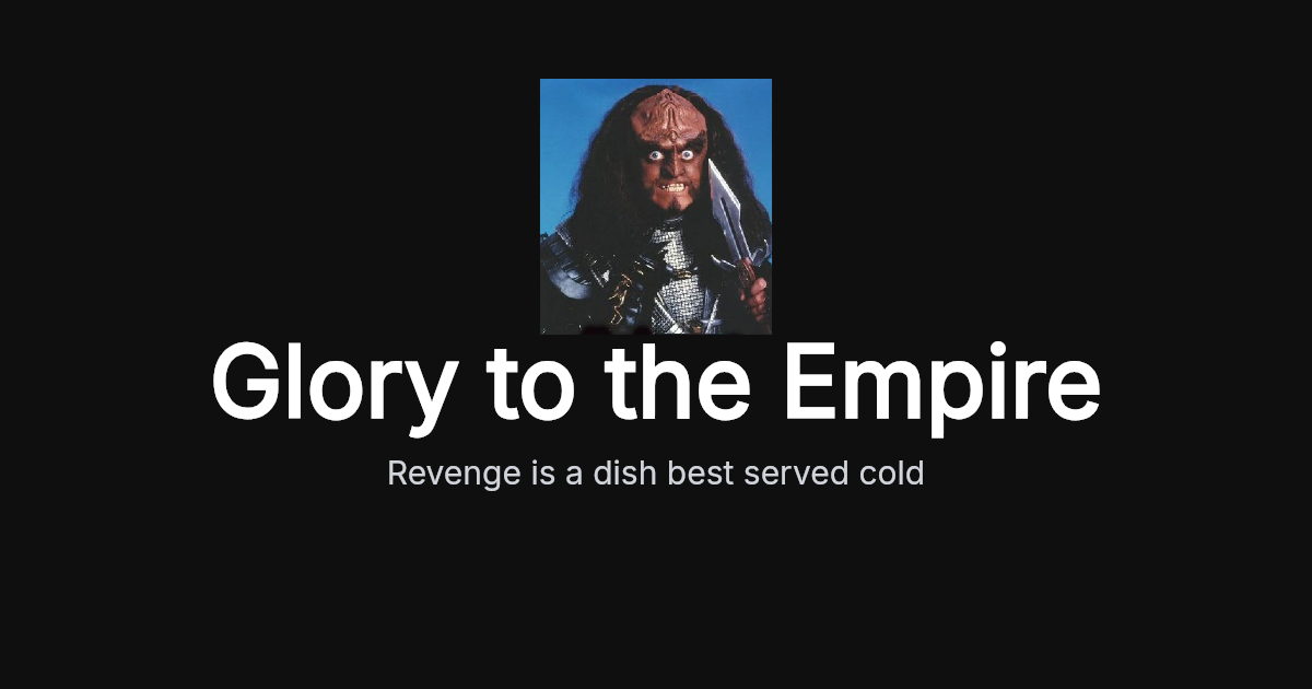
This example demonstrates excellent contrast with a very dark background and white text:

Bottom Title
Authentication platform branding
Try this example →
3. File Size Too Large
What goes wrong: Images load slowly, waste bandwidth, create poor user experience, may be rejected by platforms.
Why it happens: Exporting uncompressed images, using PNG for photographs, not optimizing before deployment.
How to avoid: Target 100-200KB (maximum 500KB). Use JPG for photos. Compress aggressively—users won’t notice quality difference between 95% and 85% JPG compression, but file size drops dramatically. Check file size before deploying.
4. Inconsistent Visual Style
What goes wrong: Brand becomes unrecognizable across shares, content feels disorganized, missed branding opportunity.
Why it happens: Using different templates for each piece of content, no design system, one-off approach instead of systematic approach.
How to avoid: Choose one pattern and create a template. Use consistent fonts, colors, and logo placement. Small variations are fine (different headlines, different background gradients), but overall structure should be immediately recognizable as your brand.
5. Light Backgrounds
What goes wrong: Harder to read, less visual impact, limited text color options, looks less professional on social feeds.
Why it happens: Personal preference or assuming readability works the same as print design.
How to avoid: Default to dark backgrounds (#1a1a1a to #333333) with white text. If you must use light backgrounds, verify text contrast carefully and test extensively. Dark backgrounds dominate successful OG images for good reason.
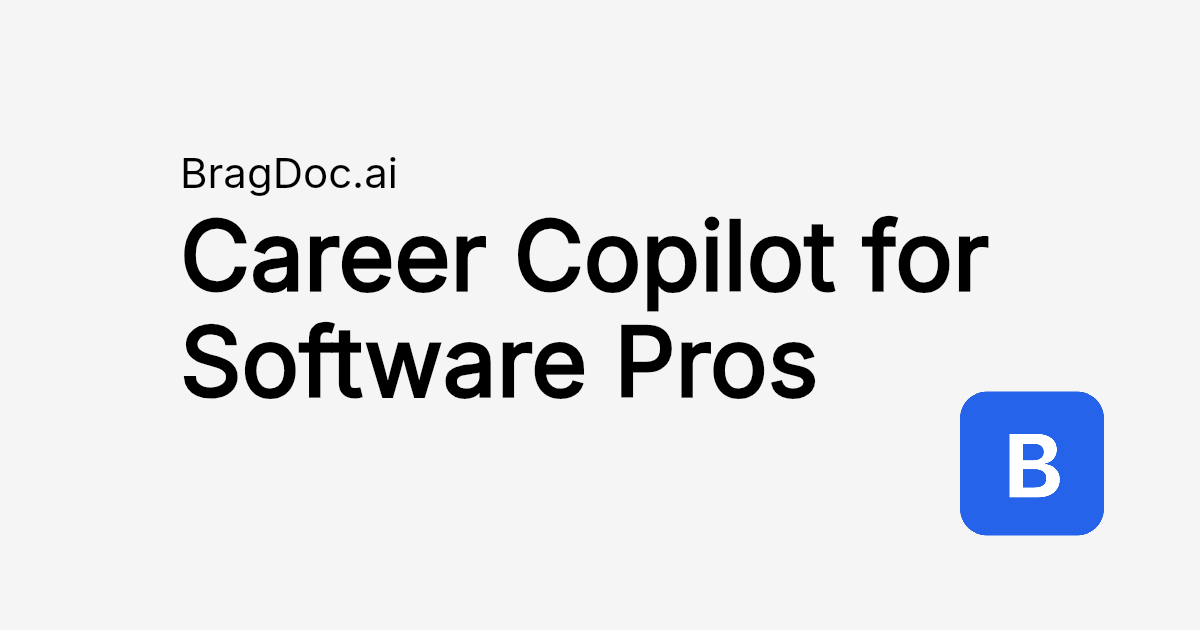
Light backgrounds can work when contrast is maintained. This example uses a light background effectively with dark text:

BragDoc.ai
Clean minimal layout with domain and large bold title
Try this example →
6. Wrong Dimensions
What goes wrong: Images crop incorrectly, text or logos get cut off, platforms display blank space or distorted images.
Why it happens: Using wrong platform specifications, not checking platform requirements, exporting at wrong size.
How to avoid: Use 1200×630px as primary size (works for 90% of platforms). For Twitter-specific content, 1200×675px. Always verify HTML meta tags include correct width/height. Test with platform validators before publishing.
7. No Platform Testing
What goes wrong: Image looks perfect in design tool but breaks on actual platforms, wasted effort, poor user experience.
Why it happens: Only previewing on desktop, not understanding platform variations, tight deadlines.
How to avoid: Always use platform validators:
Actually share test links or use validators. Test on mobile devices. Check before publishing to production. Retest after any changes—platforms cache aggressively.
8. Unreadable Fonts
What goes wrong: Text illegible at small sizes, unprofessional appearance, message lost.
Why it happens: Choosing decorative fonts that look appealing at large sizes, assuming fonts work at all sizes.
How to avoid: Use sans-serif fonts (Inter, Roboto, Helvetica). Avoid thin font weights—use 700-800 for titles. Test readability at 50% scale. Serif fonts can work but require more careful testing. Never use decorative or script fonts for body text.
Summary Table
| Mistake | Quick Fix |
|---|---|
| Too much text | 2-3 lines maximum |
| Poor contrast | Use 7:1 ratio, dark bg + white text |
| Large file size | Target 100-200KB, compress to 85% |
| Inconsistent style | Create and follow a template |
| Light backgrounds | Default to dark (#1a1a1a - #333333) |
| Wrong dimensions | Use 1200×630px |
| No platform testing | Use all three platform validators |
| Unreadable fonts | Sans-serif, 700-800 weight |
Ready to create mistake-free OG images? Try FrameIt—built with these best practices baked in.